Organize your account for maximum effectiveness with Google Analytics Motion Charts
Each keyword you use in your adwords campaigns contributes more or less to the overall return on investment. You will notice that some keywords are performing better than the others. Now the question is – how can I differentiate winners from losers?
The answer is very simple – use Motion Charts within Google Analytics! Forget about spending long hours calculating your ROI and checking the effectiveness of all your keywords – Motion Charts will do it all for you!
Motion Charts is a GA feature that allows you to measure the effectiveness and potential of your keywords over time. A Motion Chart takes your Analytics graphs one step further by offering multi-dimensional analysis of all your metrics for a given report. By using motion charts you can not only filter out keywords that are attracting the most revenue but also spot terms with the highest conversion rates. It is definitely a useful way to identify terms that have got a negative influence on your ROI over a certain period of time.
Let’s start with explaining how you can find ‘Motion Charts’ within your analytics account.
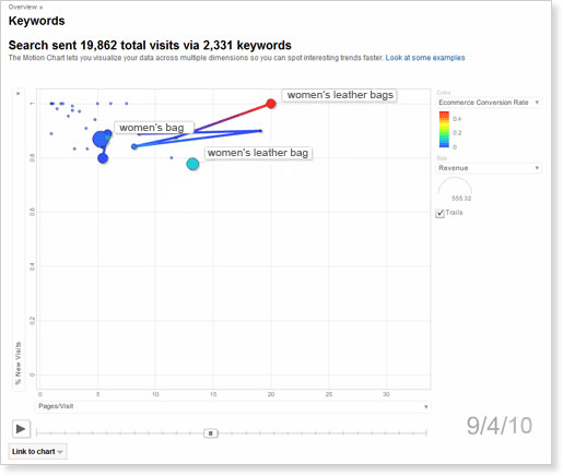
Begin with entering the ‘Keyword Report’ available within the Traffic Sources section. Click the “Visualize” icon from the table displaying segmented data. Once the Motion Chart loads, you will see an array of bubbles. Each bubble will represent a different keyword from your report.
INTERPRETING YOUR MOTION CHART
Motion chart offers you four different dimensions to plot your data. At this stage let’s only focus on the analysis of keywords with low conversion rates.
 X-axis - tracks the number of viewed pages during a single visit.
Y-axis - records the percentage of new visits.Colour – symbolises the revenue.
Size – shows the e-commerce conversion rate.
As you can see, “women’s bag “ is the most consistent keyword in terms of revenue and site engagement. It delivers sales every day, mostly on first time visits to the site. However, it has very low conversion rates. In contrast, “women’s leather bags” and ” women’s leather bag ” achieve good conversion rates, good engagement, and delivers a regular stream of revenue.
With these facts in mind, remember:
- Stop buying broad, high traffic keywords like – ‘women’s bag’ or ‘women’s bags’. Instead, optimise the site so that it ranks well organically for these terms.
- Spend more heavily on specific, more targeted keywords like – ‘women’s leather bag’ or ‘women’s leather bags’.
- Create a strategic plan to generate repeat business. Most of these purchases come from first time visits.


Aside from usefulness, motion charts are also strangely hypnotising!