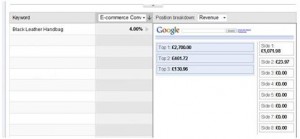
Google have released a number of new tools in Analytics that should be invaluable to help you optimise your AdWords campaigns- these are still in beta so not yet available to everyone, so check under traffic sources in your Analytics account to see if you can access these reports.
Google Analytics
GA Keyword Position Report - Turn Clicks Into Profit
Are you running a high traffic, e-commerce website? Are you looking for ways to boost up your revenue? Learn how to turn more visitors into buyers through Analytics Keyword Position Report.
The GA keyword position feature is a report tailored to Adwords users. It simply displays search position correlated with visits, conversions and revenue for each of your keywords, giving you a clear idea of how much money you make from each position. Identify the winning keywords, find the best performing ad rankings and get more out of your advertising budget!
You can access the keyword position report from GA Traffic Sources section, under the Adwords tab. Enter the term that you wish to analyse or select one from the list, choose your keyword and position breakdown metrics such as e-commerce conversion rate for the keywords and revenue for position breakdown. Compare conversion rates and product revenue gained from different positions and establish which ad rank works the best for you.
Identify the most profitable ad placements for individual terms, increase keyword conversion rates and boost your online sales.
5 Google Analytics Tips
1) You might be getting less visitors than you think. After 30 minutes, your visit counts as a new one. E.g. You browse on a site, walk away from the PC then come back two hours later.When you click on a new page or reload the current page, your visit counts as a new one.
2) You might be getting more visitors than you think. A proportion of visitors will block third party cookies (this is what GA uses to ‘tag’ you as a unique visitor) or disable Javascript to load on any site. These visitors will not be counted on GA.
What’s making money? What’s wasting money?
Organize your account for maximum effectiveness with Google Analytics Motion Charts
Each keyword you use in your adwords campaigns contributes more or less to the overall return on investment. You will notice that some keywords are performing better than the others. Now the question is – how can I differentiate winners from losers?
The answer is very simple – use Motion Charts within Google Analytics! Forget about spending long hours calculating your ROI and checking the effectiveness of all your keywords – Motion Charts will do it all for you!
Motion Charts is a GA feature that allows you to measure the effectiveness and potential of your keywords over time. A Motion Chart takes your Analytics graphs one step further by offering multi-dimensional analysis of all your metrics for a given report. By using motion charts you can not only filter out keywords that are attracting the most revenue but also spot terms with the highest conversion rates. It is definitely a useful way to identify terms that have got a negative influence on your ROI over a certain period of time.
Let’s start with explaining how you can find ‘Motion Charts’ within your analytics account.
When a High Bounce Rate Isn’t Such A Bad Thing
![]() First, we’ll start with the basics. What is bounce rate? Contrary to what many (myself included) believed, it is not only the amount of time someone spends on a website (e.g. you click on a website and immediately click off after 2 seconds) it is also the number of pages you click after the viewing the landing page (e.g. you click to another page after viewing the landing page).
First, we’ll start with the basics. What is bounce rate? Contrary to what many (myself included) believed, it is not only the amount of time someone spends on a website (e.g. you click on a website and immediately click off after 2 seconds) it is also the number of pages you click after the viewing the landing page (e.g. you click to another page after viewing the landing page).
So the two are quite closely related - for example if you spend 3 minutes reading the landing page you just clicked on, then decide to pick up the phone and ring the company, your visit will count as a bounce. But it is not such a bad bounce because you have unwittingly converted a visitor through a well optimised landing page.
