Blog
2021 to 2022 Design Trends Analysis
Candice Massaria
25 January 2026
A couple of months back, I heard somebody use the expression ‘the old world’, to define the pre-pandemic years. It sounded unnecessary and dramatic then. But, since there truly is no end in sight, perhaps the expression is closer to the truth than I’d like.
My reason for mentioning this is that design trends don’t just pop out of nowhere. They transpire from our experience, our lives, and what’s going on in the world. And, for the past 2 years we’ve been through a palette of emotions, hopes, despairs, and we’ve adapted, on and on.
Here’s a humble little recap of what’s been shaking the trends last year and why, and a dive into 2022’s grand design.
3D Trend from 2021 to 2022
It was announced as the main trend on the graphic design scene in 2021. And boy has it been everywhere – from apps and emojis, to photoshop brushes, optical illusions, typography and voxel art.
So, why was this movement more meaningful than the others blooming this year?
Let us pick up our 3D frenzy where we left it, back in 2019. Playful 3D-rendered type was challenging our composition habits and literally made our words ‘pop’. Whether it was real rendering, or illustrative emulation, the need for a sense of reality and tangibility was there.
But at that point, we were still in a digital abstract mindset. In appreciating the perfect smoothness from afar, we weren’t totally immersed and involved within that three-dimensional bubble.


2021 saw not only a technical upgrade –with new patches being added to Illustrator– but also an openly-admitted thirst for realism. The abstract 3D world we created wasn’t enough for a post-pandemic community. This time, we needed to step into the matrix, and create a reality we can personally identify & connect with. Very much like the one we lived the past year and a half.
I happen to see this three-dimensional trend mirror our newly-found habits. Nobody goes to shops anymore, we shop online instead, and so forth. Hence this need for a three-dimensional world in our own image, our new and bizarre IRL. An intimate, close to home, yet surreal reality, made out of familiar and long-lost environments.


On top of that, we kept coming back to 3D-rendering our words. The desperate attention-seekers we are, always making a statement to the world, having something big to say, to shout. Since the beginning of the pandemic, people staying safely at home coincided with creativity coming out bolder than ever. Maybe we’ll calm down in 2022…or not.

Type & Brand in motion from 2021-2022
Predictions were made that 2022 would see the digital world –type and brands alike– in motion. Vivid colours, high contrast and cheeky characters are foreshadowed, along with the importance of storytelling through motion. The combination of the two might remind you of the animated title sequence of Squid Game, perhaps?
Now, I am no trend-setter, but I would love to see either a newly-found interest, or an old passion, ignited for the Korean alphabet, Hangul, and the powerful message of independence it stands for. At the very least, since the interest towards non-roman characters has already been primed these past few years, hopefully we’ll see it with a focus on the characters themselves.

Motion is definitely bound to bring more character to our stories, and more stories behind our characters. It seems like having had the world on pause for two years left us craving for new sensorial experiences.
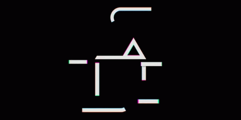
Speaking of experiencing and experimenting, we can expect the boundaries of expressive lettering to be pushed even further than before. But that’s pretty much happening every year consistently, right? We just love to re-invent the meaning of our words.
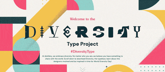
Only, this time, we embrace the diversity, as opposed to consistency. Below is a collaborative type project which really embodies the dynamism in all its glory, making each letter as different as possible from one another. Again, it may remind you of another title sequence – proving that it is already anchored in our day-to-day lives…
This trend will undoubtedly expand to our font choices in this new year.
Blast from the Past in 2022
You would think, after reading all this, that 2021’s trends were looking forward and not backwards. Yet, while all this 3D in motion is taking us on a futuristic journey, our eternal nostalgia draws us back to… The 90s (again!). We all regularly indulge in a slice of nostalgia, and it often is with optimism and a kindred outlook. So this one trend helped 2021 with a boost of optimism we desperately needed.
We always go back to comfort years when we’re vulnerable, and there is a sense of intimacy in this particular trend, which is very interesting to look into.
While our greatest designers observe a resurgence of the 90s aesthetics from Tiktok, I wouldn’t go as far as calling pre-teens ‘trend-setters’. I mean, children’s music and sea shanties were everywhere on the platform at some point, yet you won’t see it bridge the gap to the design world. But, if the visual codes aren’t mastered, the uninhibited spirit of the 90s is very much alive.
The example below really reflects the essence of that 90s nostalgia; the collages are handmade – a solid opening statement – the bold coloured shapes are grossly cut out, the halftone pattern clashes in contrast to the rest… 90s aesthetic is bold and bright, and doesn’t have that level of frustration and fear.


Maximalism (Wild West)
Logically, this trend stands as the opposite of minimalism. Functional elegance has long been the law for a lot of designers – you’ve probably heard of ‘Less is More’, a quote from the architect Mies van der Rohe that inspired generations of creatives. And here we are, after years of prevalence, about to witness the explosion of ‘Maximalism’.
We are indeed facing a shift in the balance between content and (white) space. For this reason I wouldn’t call maximalism the opposite of minimalism, as stupid as it may sound. In 2022, More is more. Less white space, more meaning, it’s time we celebrate the brave, the bold, the loud, the free.


This inspiring wind of courage isn’t translating only into maximalism. We can go further down the path of emancipation, which brings me to a trend born out of similar motivations.
Anti-Design in 2022
Remember the time when graphic design was only paper, glue and scissors? A time when there was no Ctrl+Z, and you had to own your mistakes and add on top of it? Well, the digital equivalent of this – Anti-Design – is here to take us back, 2022-style. The trend was already settling last year, but shows no sign of backing down.
Anti-Design is highly controversial: some find it ugly and would describe it as a mutated, rebel, version of brutalism. Meanwhile other critics think it’s a ground-breaking and frivolous statement to the face of the Design world.
And this uncertainty with Anti-Design is born from the impossibility to tell the master from the amateur. The illegibility, the clashing colours, the slanted misaligned images… Who is to say this piece isn’t from someone’s first year as a graphic design student? Or from an experienced designer who liberated himself from 10 years of rules and boring client work? Not so easy to verify.
It is decadent, it is bold, and it is closely tied to the fashion world.
But no one can argue that it is hypnotising. And I’m not talking about the visual cacophony making your mind twirl and your eyes confused. The amount of courage it would take us to own such work trumps your own courage. Anti-Design leaves me dazzled with the feeling I couldn’t have done it. Much like when you’re in front of a contemporary painting.


And it’s a story we’re all familiar with: Baroque opposing Classical, Impressionism opposing Realism, and Dadaism opposing the world. This age-old fighting dynamic can, and does, justify the ugly, confusing, and brave.
But I’ll take this comparison further to expose the limits of Anti-Design. It is so easy to stand in front of Duchamp’s empty urinal, nod your head in validation and pride yourself for understanding a higher form of art. It is a different ‘matter’, if you will, to open Manzoni’s boxes and still pretend the art you thought you understand, isn’t pure crap.
My point is that this trend might be stopped in its tracks, when people eventually realise this anti-conformism is just blooming into another conformism. Yet, this unapologetic attitude may stick around…
Final Words
Hopefully, understanding graphic design on a deeper level helped you – like it helped me – to build a stronger connection between inspiration and reality. Feel free to hate, worship or debate these movements, because they aren’t the radical truth and definitely not set in stone.
I’m very excited to see how these trends grow, fade or evolve in the course of the next year. But the changing world isn’t the only element needed for good things to bloom; it takes a lot of talented individuals to motivate change… So be one of them. Shake your own graphic design ways, ask yourself the right questions, prove them wrong.
Written by
Candice Massaria
Latest posts.


Contact.
We’re always keen to talk search marketing.
We’d love to chat with you about your next project and goals, or simply share some additional insight into the industry and how we could potentially work together to drive growth.