Blog
Spotlight on 3D design
Candice Massaria
03 March 2026
In my previous post, I mentioned the relationship between trends and everyday life. One of the highlighted movements was 3D. But we only scratched the surface, it’s now time to look deeper into the 3D-verse.
There is something interesting about the shift that has occurred between the real world and the virtual world. Both had merged during the pandemic, making work step into our intimacy, and breaking our never-questioned-before life schedules. A need for playfulness in our lives has emerged, translated in our ads, our interests & our visual environment in general.
Bubbly Connection
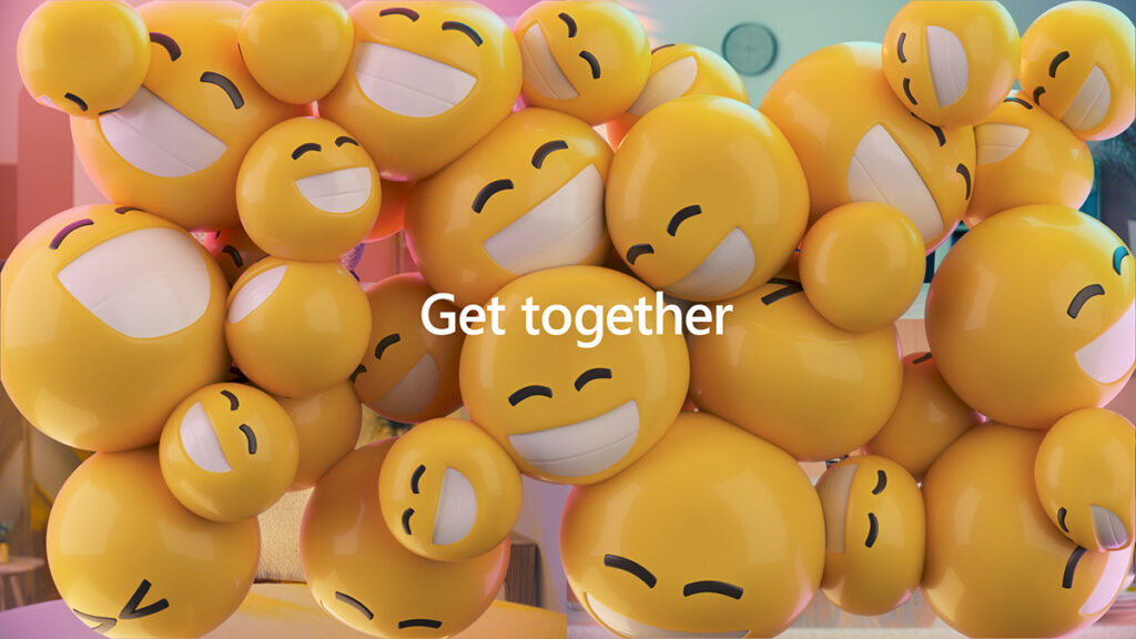
And what better introduction than this video released last October for Microsoft Teams. This piece showcases everything incarnating the essence of the 3D movement, with the logo turning into an impressive 3D animated render (virtual becomes real).
The example shown is one of a family connecting and not a work team (points for intimacy), the mention of our daily chores (points for reality), the joyful bubbly emojis (wink to another 2021 trend, and points for fun), the claustrophobic amalgam of said emojis (hello covid), the ‘get together’ message (f*** you covid)…
The overall sense of togetherness is absolutely nailed, and it really embodies Teams as the connecting solution to our daily communication struggles. Really interesting indeed.
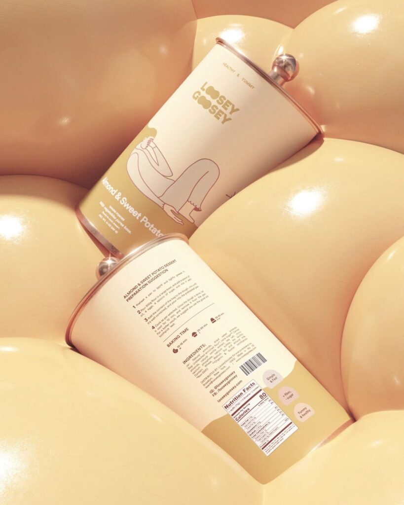
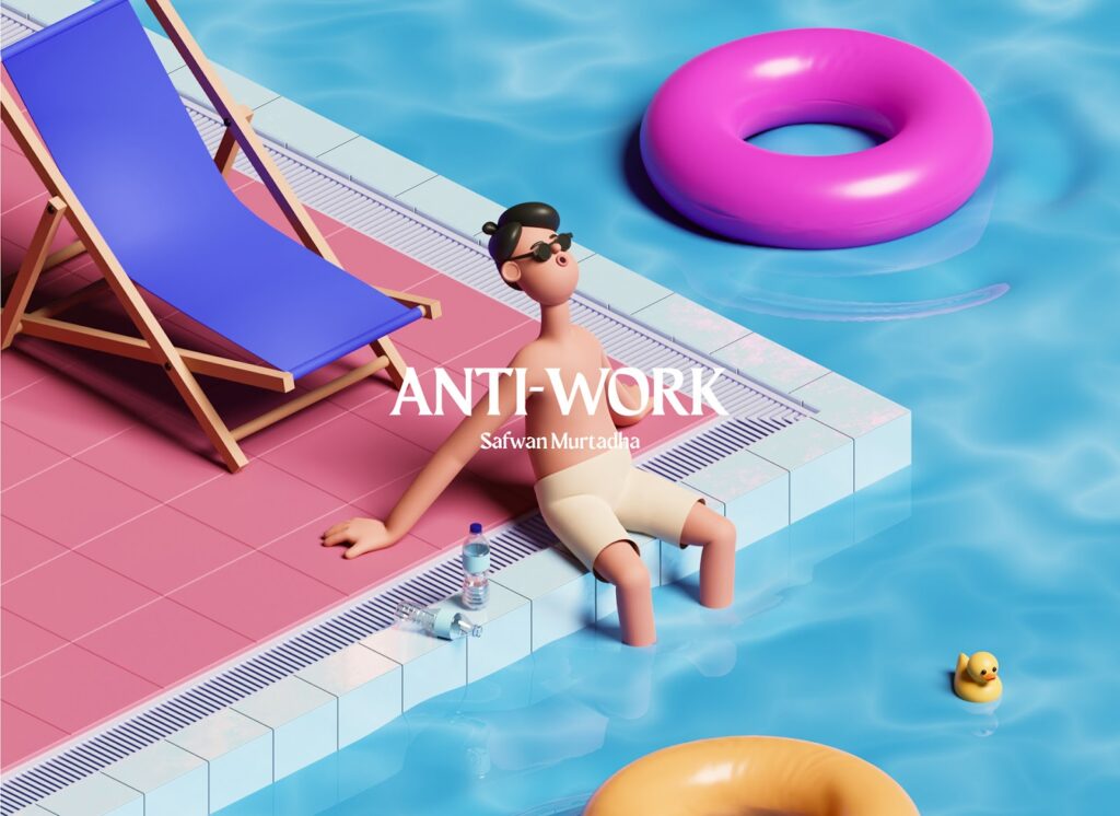
I found a vestige of this cluster-like visual pictured below from late 2021. The bubbly shapes merge together in a reassuring fashion, and this friendly roundness inspires rest, cocooning and self-indulgence. You just have to love how the product literally sinks into the cushiony agglomerate
The main concept puts forward the process of reward through food; the colours are as smooth as the rendering is. Although there is a guilt-free visual environment being staged, the illustrations on the packaging itself are honest and raw, depicting the bad day blues that the product is meant to bring comfort to. There is a certain sensuality in this work, which brings me to my next find.
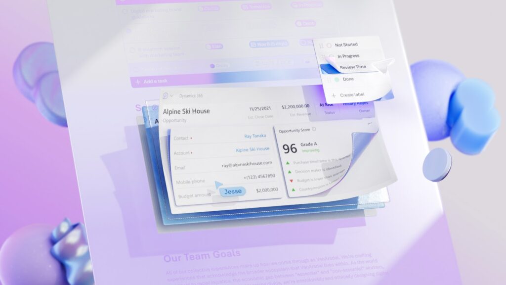
I couldn’t help but notice Microsoft Loop also had its own presentation video, more recently this January. In this instance, the animation and sound design are really the star of the show. One of the authors describes the piece as sensual, and they’re not wrong; the smoothness of the transition and colours, the absolute fluidity of the animation… They are so immersive, you just want to dive in it.
With the target being specifically Gen Z, the creators opted for a bold, diverse, and beautifully coloured visual playground. The rhythm in the video is mastered to say the least, with clever hints of stop motion to avoid an overdose of fluidity. I believe this need for our reality to be transposed in a 3-dimensional space we can shape at will, is here to stay. And yes, I find myself a little bit amused that the studio in charge of this piece is called…NotReal.
Characters in our image
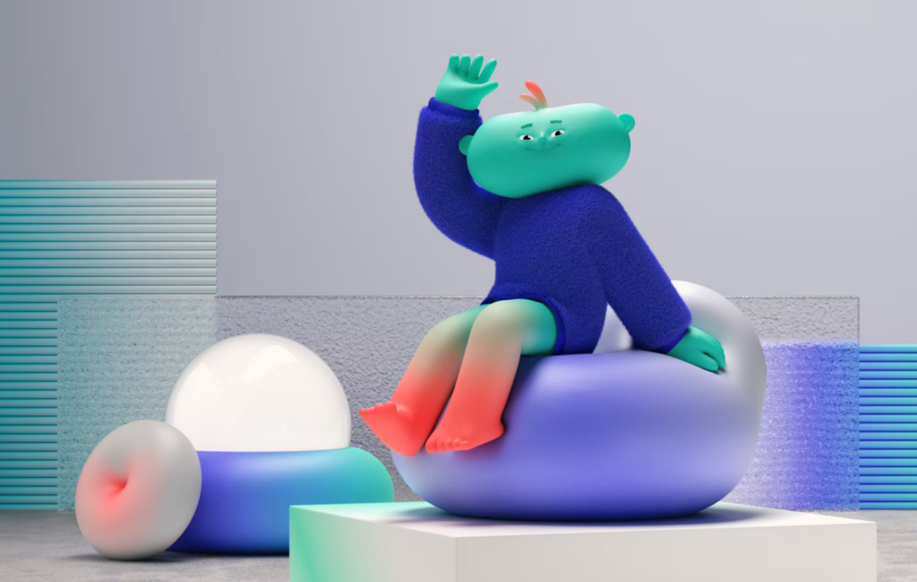
I observed a flourishing angle to the 3D trend; bubbly, huggable, emotionally connected, reaching out to our feelings and need for comfort. Personification is key, and the characters brought to life reflect us and our moods. In this case (above), the warm and cold colour fluctuations mirror our evolutive feelings. It also appears to spread to the animation scene more than graphic design solely. Let’s see what’s in store on the more static side of things.
Well, more characters. Still playful and smooth, they celebrate us and our good side: vivid colours, holiday spirit and chill out vibe. Past the infamous (and perhaps a bit fantasised) ‘January Blues’, it is time to remember what time off is like, now Christmas feels like a long-lost dream.
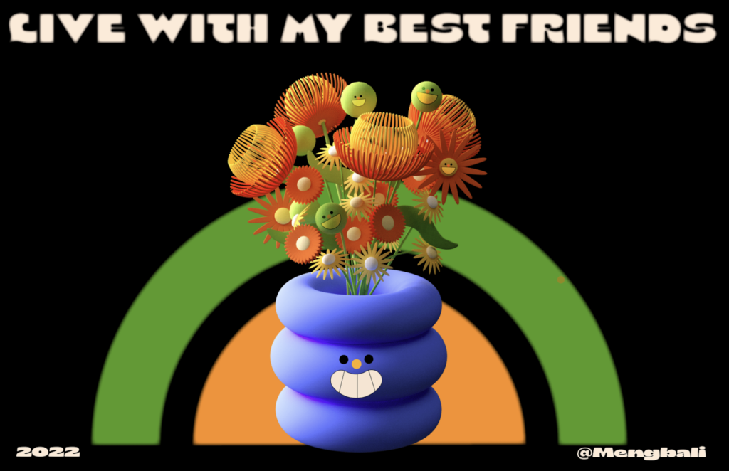
The example below gives another lesson of togetherness, sending a meaningful message under a friendly and naive cover. Simple render and cute faces added to the elements (flowers, vase, fruits) keep the tone light, while the several compositions celebrate the flowers and their singularity.
‘Live with my best friends’; the message is clear, and invites us to contemplate its meaning in our new post-covid world. Cohabit, connect, tolerate and coexist with everything that makes us different and everything that brings us together… Since we’re all in the same vase, we might as well bloom.
Chubby Tigers
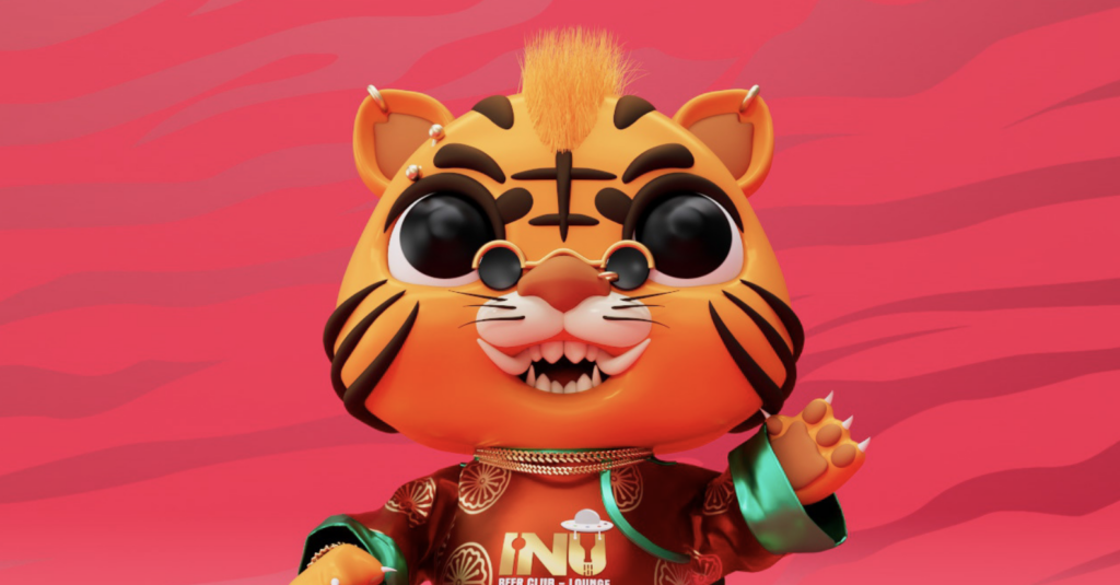
A few weeks after Marvin, I found something else emerging. Freshly stepping into February, the creatives of the world turn their attention to… The Year of the Tiger! That’s right, the Chinese new year vibes flood our favourite inspiration websites, and it rocks. I stumble upon more 3D characters; cute, round and soft little tigers.
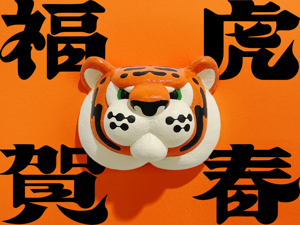
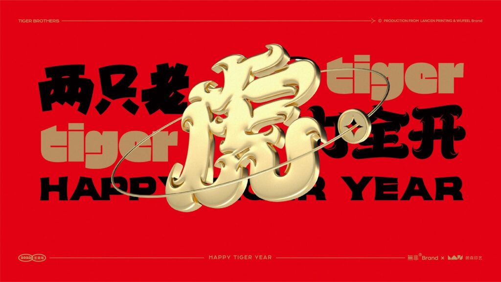
But with the ingenuity and kawaii comes the high contrast between orange and black, hard blocks of ideograms, and the decadent gold and red combo so characteristic of China’s aesthetics and mythology. The elegance, the fluidity, gives way to a bold and confident approach. The following example even tampers with 3D printing instead of high-end rendering, which gives the project a nice return-to-sources dimension.
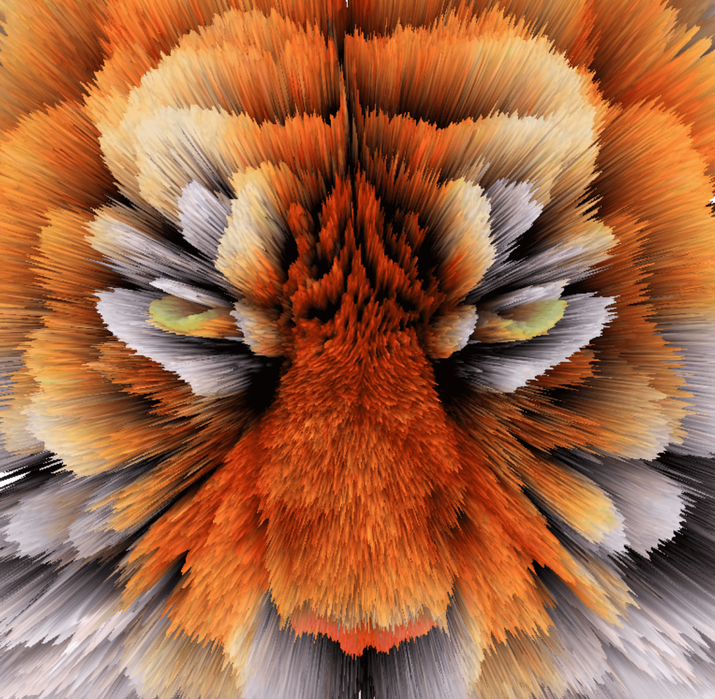
Past the first wave of gimmick-y characters, I came across a different approach to honour the tiger, which I found quite interesting. Because it doesn’t have to be a render, it doesn’t have to be actual 3D – all you need is a great use of shadows, directions, and perspective to create a good 3-dimensional piece. This tiger portrait plays with converging lines mimicking the fur, emphasising on the movement. This is truly what the Chinese new year is about: transitioning, stepping into a new world, getting rid of the old year and its bad habits. The multiple layers masquerading as a hyperspace simulation is a clever allusion to space, which hosts the moon and is home to its lunar cycles (which are the focal point of the Chinese Calendar).
3D Type from the East
As I hoped, there has been a resurgence for 3d type and its expressivity, along with a rekindled interest for non-roman characters. If you missed Ibrahim Hamdi’s work in 2021, please drop everything and go check it out.
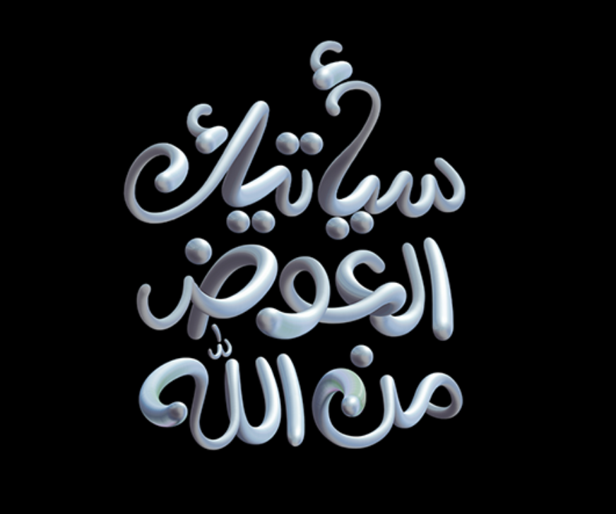
Now, you would be tempted to find the liquidity of the below example secondary, as the work here is more about showcasing the Photoshop mixer brush tool… But, don’t be fooled, the stylisation of such calligraphic typography demonstrates great skill. Not convinced? Don’t forget the reading starts from the right instead of the left. To me, the spontaneity of the shape honours both the cursive nature of the Arabic alphabet and the candour of the communication. A refreshing modern take on the traditional and quite strict Arabic lettering system.
Later in February, I was delighted to find another piece with oriental characters at its heart. Even though the alphabet only mimics 3 dimensions and is actually just flat, the brush effect and its negative space do the trick. While the example above unified the flowing text with one motion, here the brushstrokes break the character down. An homage to the technique and the complexity of one’s language codes. One line started left instead of right, a stroke touching another where it shouldn’t… Any mishap, and the ideogram means something totally different. The boldness and colour contrast do a great job of making you elude the anti-design take of the project.
Unfortunately my passionate chase for a piece showcasing Hangul (the Korean alphabet) came to a disappointing halt. Who knows, perhaps it will serve as a medium for other trends… But I am failing to see which one could flatter it as much as 3D could have, in terms of meaning.
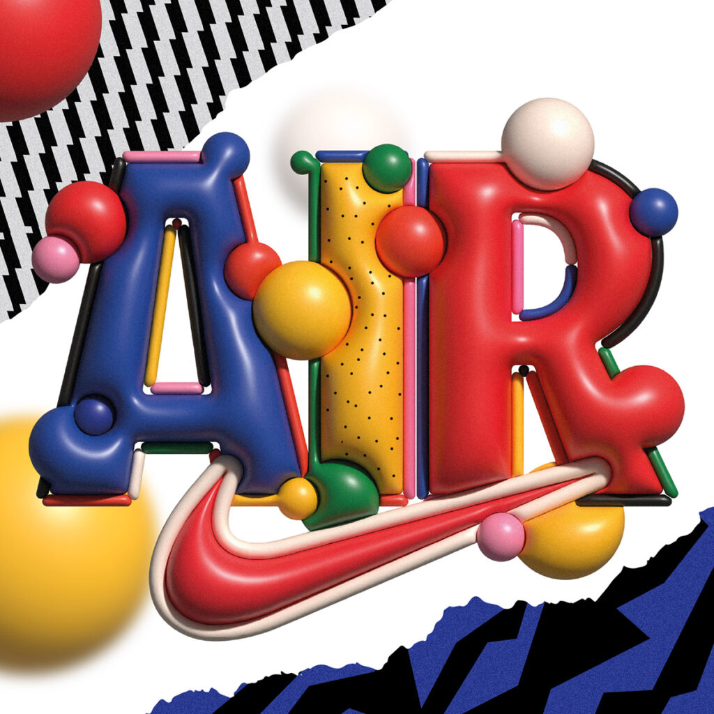
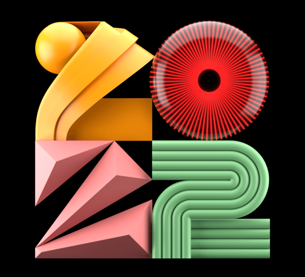
3D Type from the West
After some digging, I came across some examples exploring the richness of 3D even further. This time, we take a closer look at what a dimension really is. Multiple layers of flat colours, a layering of shadows, and a juxtaposition of plans. In the spirit of optical illusions, you can’t tell background and foreground apart. This playful take makes the composition more difficult and represents a challenge for whomever creates it. Yet it enhances the real depth and allows flatness to become texture.
But soon enough, we go back to the bubbly comfort, with a hint of 90s nostalgia in the not-so-pairable colours and uninhibited simplicity (we will dive deeper into this other trend in a separate article). Again, shapes merge and sink into each other, or push them away and cohabit.
Or, in other cases, we drop the interest for the letters and their meaning, we only use them, as we once did, as canvas for our plastic experiments. And after all, it is a bit refreshing to emancipate ourselves from the weight of words, only to play, to test, and appreciate our shapes differently.
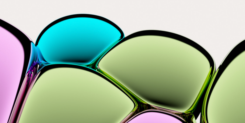
I found more of these beautiful experiments on 3D texture; it starts off with an immaculate glass-like pattern, and after a couple of tests it turns into a beautiful neon glow, to finally transcends into an intricate multi-layered and colourful mass.
I like this example because it shows the intrinsic curiosity which makes us, the desire to always investigate and cut open the world to see what’s inside. And if you don’t believe it’s a thing, observe the little ones pulling their mom’s hair to see if she hurts, or breaking their toys to see what they are made of… We are curious by nature. And this side of 3D might just sign the end of the trend. Have we done everything we can in and around it? Have we run out?
For now, maybe. I don’t doubt the trend will keep evolving this year, but I can already see it being overshadowed by other upcoming trends. I kept running into hints of Anti-design and 90s aesthetics during my research for this article, and I’m excited for my next analysis!
Written by
Candice Massaria
Latest posts.


Contact.
We’re always keen to talk search marketing.
We’d love to chat with you about your next project and goals, or simply share some additional insight into the industry and how we could potentially work together to drive growth.