Top 10 Web Design Trends for 2014
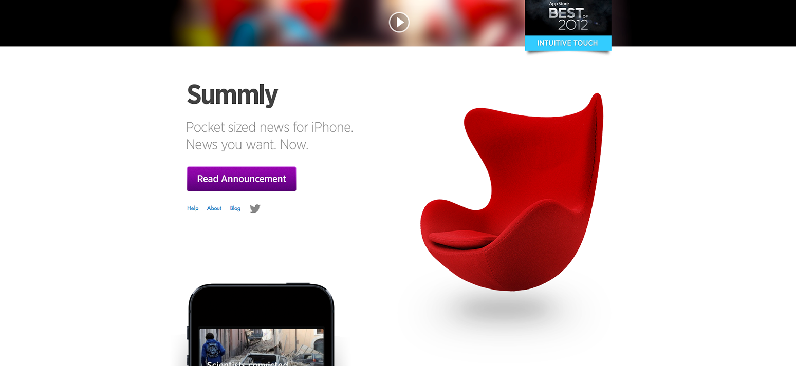
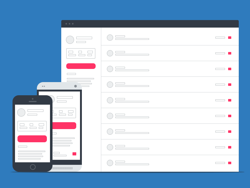 Mobile
Being immersed in the internet on a daily basis we see platforms evolve at an extremely fast pace.
Today, more than ever, the user is also a producer of content.
In the past, this user generated content was just some simple designs and cat videos, but today we see 16 year olds redefining technology and innovating with new modules, frameworks and approaches that are then shared freely with the world, thus pushing web innovation forward.
To illustrate this process, we present you with the top 10 web design trends for 2014:
1. Animation:
Up until recently, most websites were only taking into account two factors; structure and aesthetics. Today, an increasing number of websites have started taking a new variable into account - time.
The timeframe unveils more advanced possibilities in terms of animating web elements in order to present them in the right time, thus creating an interactive flow that helps the user dive into the content.
Examples:
Guillaume Kurkdjian

Pasquale D’Silva
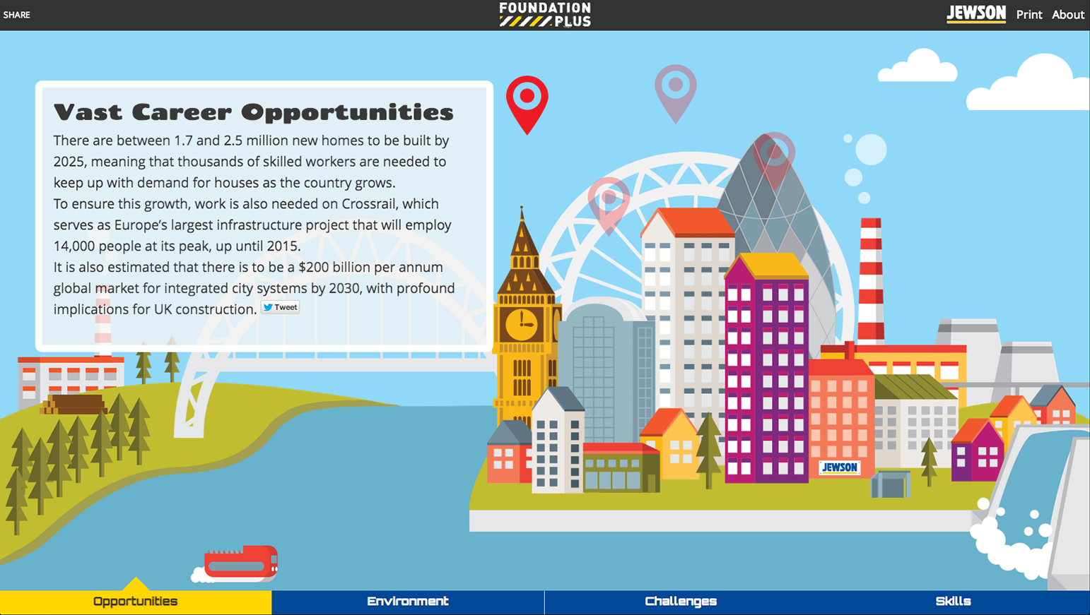
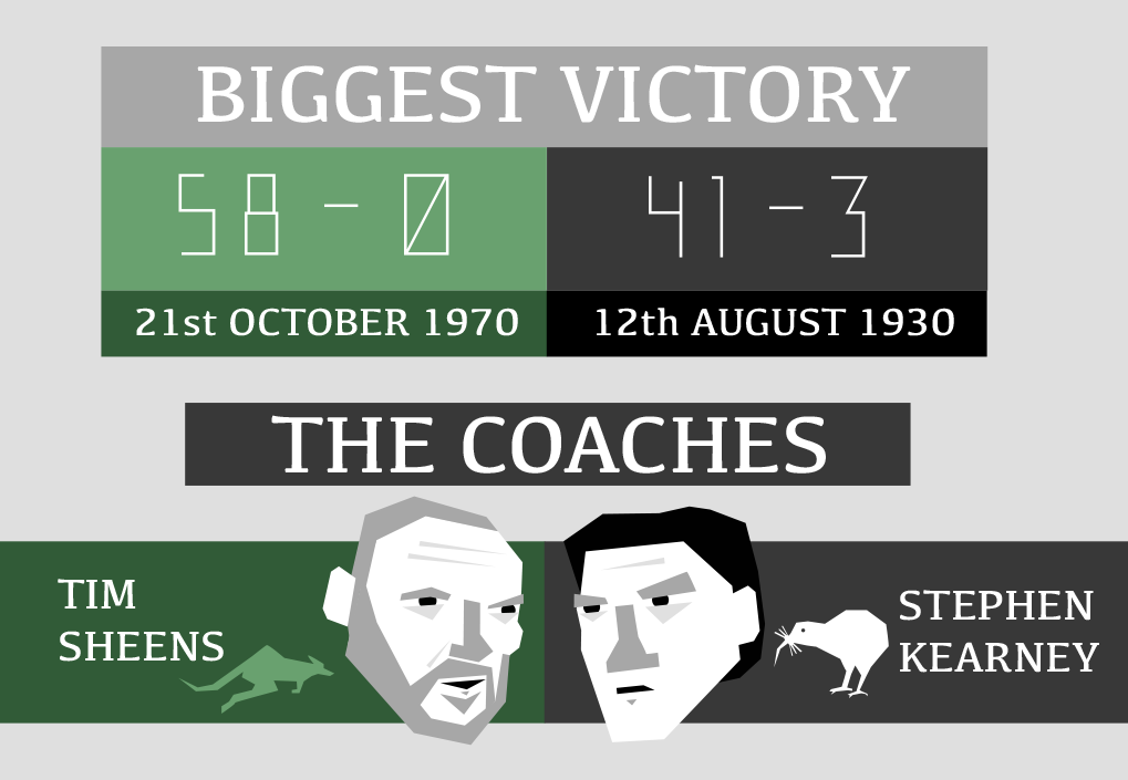
2. Infographics & Illustration:
We have all assisted to the proliferation of infographics. Most of them are pretty good, but why is this important?
A good infographic goes hand in hand with programming and/or content, creating a synergy that successfully presents complex data in a perceivable manner.
From interactive websites to blog posts, infographics help make sense of data. On the other hand, illustration helps give identity to content, brands and data.
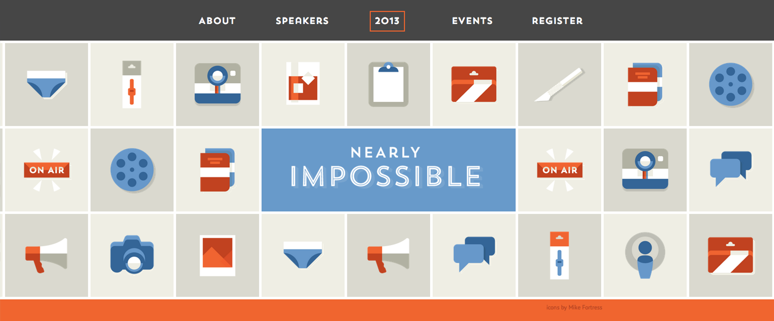
3. Flat Design:
Flat design is everywhere today. We are coming from a time where most elements were highly crafted with gradients, shadows, depth, glow and strokes to make the content pop into a context of simplicity and flat colours.
This not only enhances readability but also makes the pages lighter and quicker to load in different devices.
4. Responsive Design:
This expression is pretty much everywhere nowadays. And if “responsive” is now being taken as a given fact when designing a new website, it’s important to do it right.
It’s fairly easy to fall into the trap of simply using media queries to adapt the platform to different devices, however, this not only increases the development time, but also creates a platform that is not future ready.
A truly responsive design needs to be device agnostic and take more variables into consideration, such as a mobile first approach, the creation of design modules, the utilisation of scalable content, images and an underlying strategy that is willing to make sacrifices around the fact that content and purpose are the key to present a platform.
5. Mobile First:
A huge percentage of the world’s population is now consuming information on their mobiles so rest assured mobile data consumption is here to stay and ever growing.
A mobile first approach positions the development starting point in the mobile view and then expands from that point into other devices. This assures that the lightest possible content is loaded when viewing the website in mobile devices, thus increasing the load and complexity of the elements for other devices that are, by context, prepared to load heavier images and content.
Building with a mobile first approach (following a logic of progressive enhancement) is fairly different from building top down (graceful degradation) and one should use this approach depending on the focus, scope and deadline of a given project.
6. OOCSS3 and Preprocessors:
By assessing these new trends it soon becomes evident that the world of front-end development is rapidly evolving in a structured manner.
OOCSS (Object Oriented CSS3) is the starting point for a clean, modular, scalable and light approach to styling a web page. A concept that has been around for some years now but has been pushed strongly by Nicole Sullivan.
As explained by Nicole, OOCSS follows two simple principles:
- Separate structure and skin
- Separate container and content
A good CSS is easy to maintain and extend, allowing for multiple people to dive into a project and quickly extend its functionality.
On the side of preprocessors, it allows programmers and coders to achieve a better structure as a modular approach is incentivised. Ultimately, preprocessors give more power and speed of coding to the style of a website.

More on preprocessors:
- SASS
- LESS
7.Typography & Webfonts:
At a time where gigantic amounts of content are consumed daily, it’s imperative that the content is not only succinct, objective and relevant, but also that it’s responsive and readable. This being said, it’s imperative to properly improve a website by nurturing it with legible font’s that can convey the message clearly.
We’ve all seen how Medium has dramatically improved the blogging world by creating a typography and content focused platform that serves information clearly.
Various factors should be taken into consideration whilst preparing digital platforms to reach their targets.
8. Video
Up until recently, we’ve been approaching video as an element that must be caged into iFrames and containers that really limited the capabilities of this media resource.
Recently, some new efforts and developments have been appearing, breaking video free from its unnecessary constraints and allowing it to be seamlessly integrated into a website.
I’m talking about examples like these two:

This js module seems to be making the most relevant effort into helping master video integration, unconstrained:
https://github.com/sfioritto/charlie.js
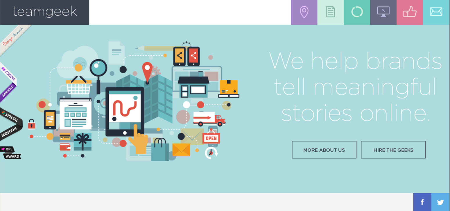
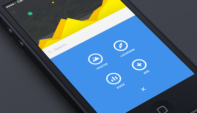
9. Clean, Simple and Objective UI/Design
Ever since the world has gone online, we’ve been experiencing a learning curve of patterns, navigations, visual information and structured browsing. This means that we have evolved in the way we consume digital information.
Now we can easily associate icons with expected actions and easily find our way inside a website. But for this to happen, there needs to be an emphasis put into the User Experience and the underlining usability of the interface.
Oversimplification is here and it seems to work (depending on the context). Websites should be ultimately built around their purpose. “What do I want to achieve through this platform? Is it more registered users? Presenting a product? Explaining complex information? Learning? Teaching?
This goal should be always forefront in the mind when developing content or designing a platform.
Quoting the early 20’s architect Ludwig Mies van der Rohe: “Less is more”. And I believe this should be a strong pillar for UI/UX design. “Less” focuses the user into finding what he came there for, ultimately conveying a clear message.
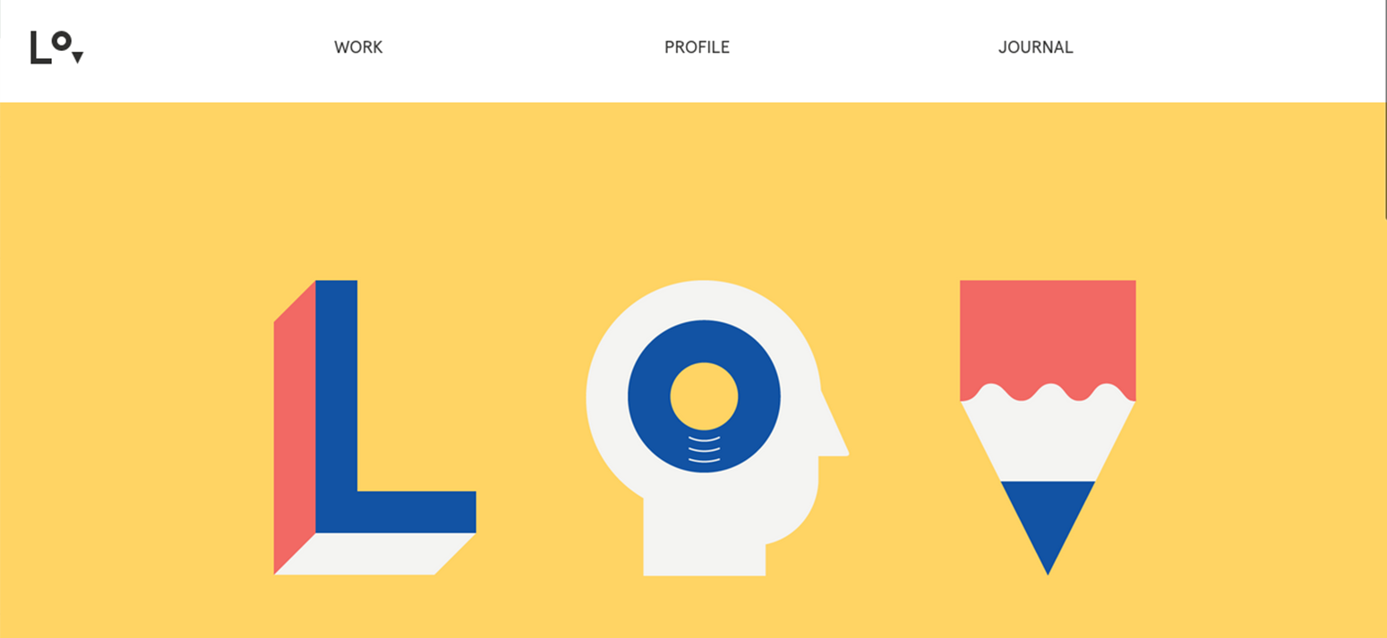
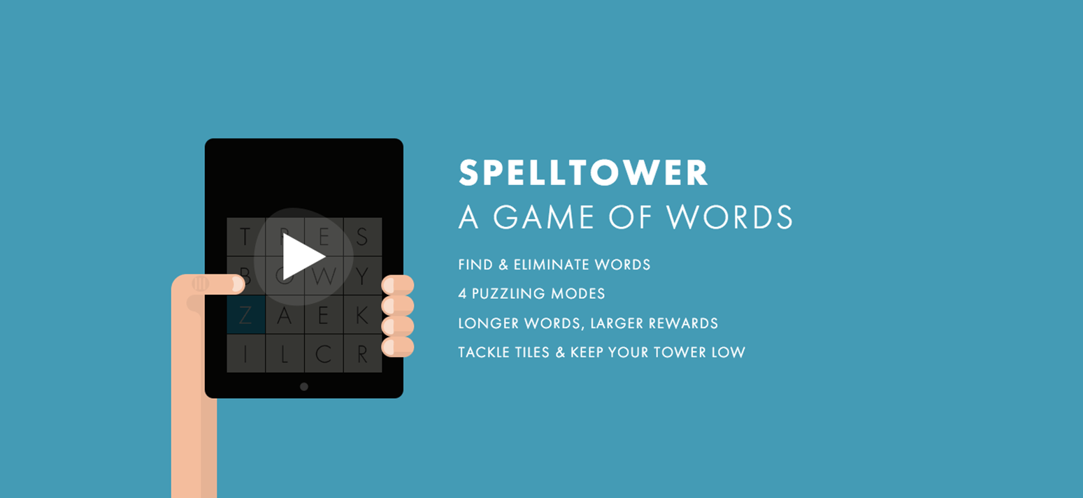
Here are a few examples of clean and simple UI/UX:
10. SVG’s mastery and Abstraction
SVG’s have been emerging evermore frequently into the web as they are the perfect match for responsive design. Being a vector image, they seamlessly adapt to any size and are highly customisable with code. Even though this world is now starting to be explored, the most recent examples show that the possibilities are truly limitless in terms of their manipulation.
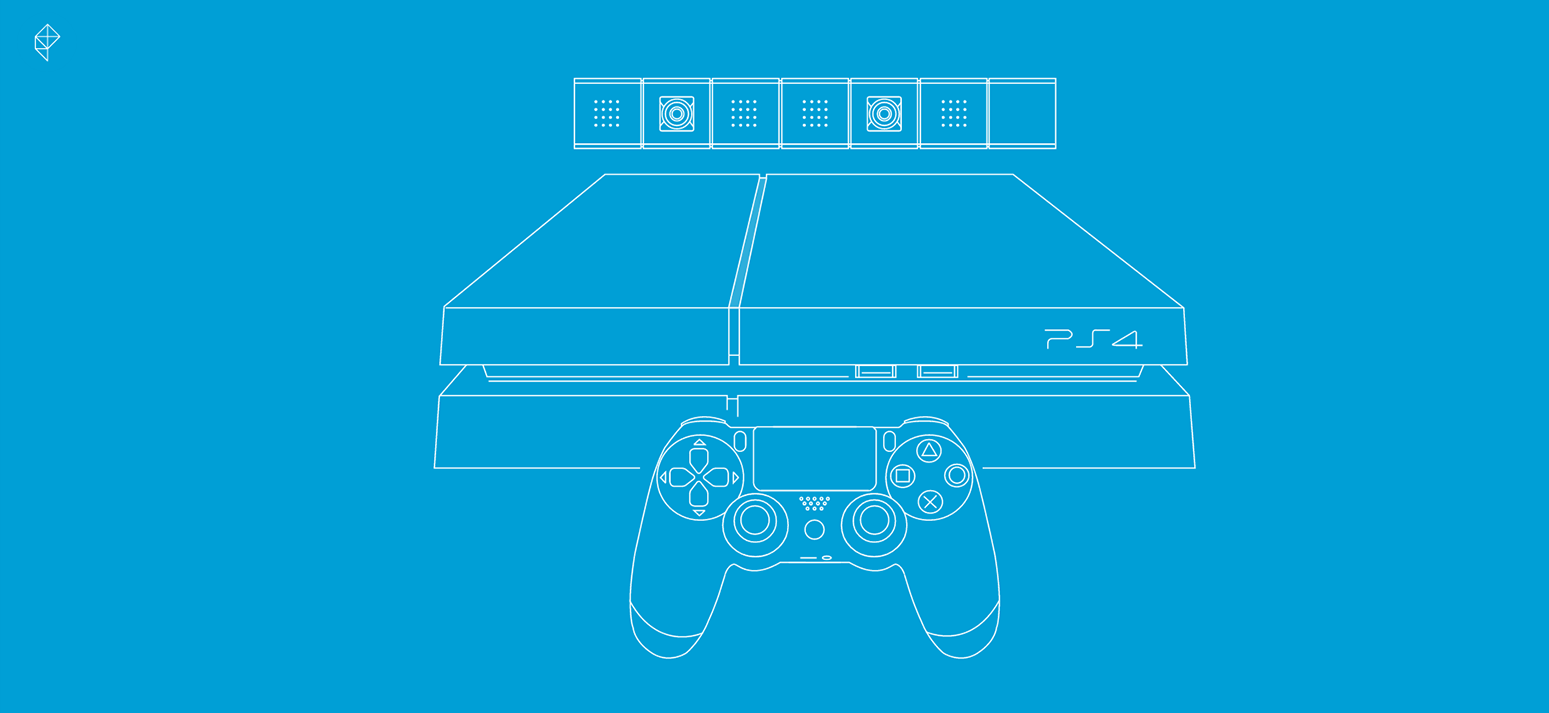
Here we can find an example of content, code and design in perfect harmony to deliver a fantastic piece of content:
And there we have it. There are other trends like parallax scrolling and such, but I believe the above to be the most significant patterns we’ll find throughout 2014.
Do you think I’ve missed out anything vital?
