Google’s New Look
 Google
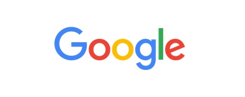
 Anyone with access to social media (or just the internet) will probably have noticed Google’s new look as of yesterday. This marks the start of their rebranding; something which Google says reflects the evolution they have undergone over the past 17 years.
Its new logo is simple, and almost childish in nature. According to the official Google Blog, this is a deliberate attempt to show their values; simple, uncluttered, colourful and friendly. The iconic colours have been kept, albeit in a different, brighter hue, meaning the change in typeface is the big killer here. Google actually invented this typeface for their logo; called ‘Product Sans’, it is a huge leap from the serif typeface they have used for the better part of 17 years.
While some on social media are embracing the update, others are rejecting it – something that is to be expected whenever an iconic logo changes, although I’m sure it will soon be forgotten, much like the Coca Cola rebranding of late, or Facebook’s numerous redesigns.
.@google's new #logo is litterally horrible! #google
— Sandro Army (@sandroarmy) September 2, 2015
Liking Google's new logo animation. Very slick! #Google #Logo pic.twitter.com/fDkkwoY6yv
— Thomas Dyson (@MrTDyson) September 2, 2015
Another change being made is that the logo will no longer be a static image. Instead, animations will be used to reflect the action being made by the searcher; for example, using voice search will see four dots transform into a mic, while mobile searches will see these dots change into a colourful ‘G’. These changed are intended to represent the different ways in which consumers interact with Google, from Search, Maps, Gmail, Chrome and Android, among others.
This rebranding comes as Google prepares to join Alphabet, an action that will see it retain search, YouTube and the majority of its biggest divisions while smaller operations will work as separate companies. The intent behind this is to stop Google throwing money into projects with little connection to online search and advertising. However, it’ll be a few months before we see anything from Alphabet, giving Google plenty of time to roll out its rebranding, and us plenty of time to speculate what Alphabet has in store for us.
To celebrate their new design, Google have given us a video highlighting their evolution since the beginning. You can watch it below, or over on their YouTube.
Personally, I’m neither here nor their with the new update. It’s a little kiddish for me but as it doesn’t impact how I will be using Google, I’m not going to complain. What do you think? Tweet us at @blueclaw with your thoughts.
